@rodrigojrmartinez wrote:
I have a doubt regarding how to arrange my pages to ensure a nice experience when navigating to one page an another. Lately I have changed the whole structure of the application and I still have several problems, with different approaches it looks bad on android and on some others on ios
What is the ‘expected’ or ‘recomended’ way to arrange your pages?
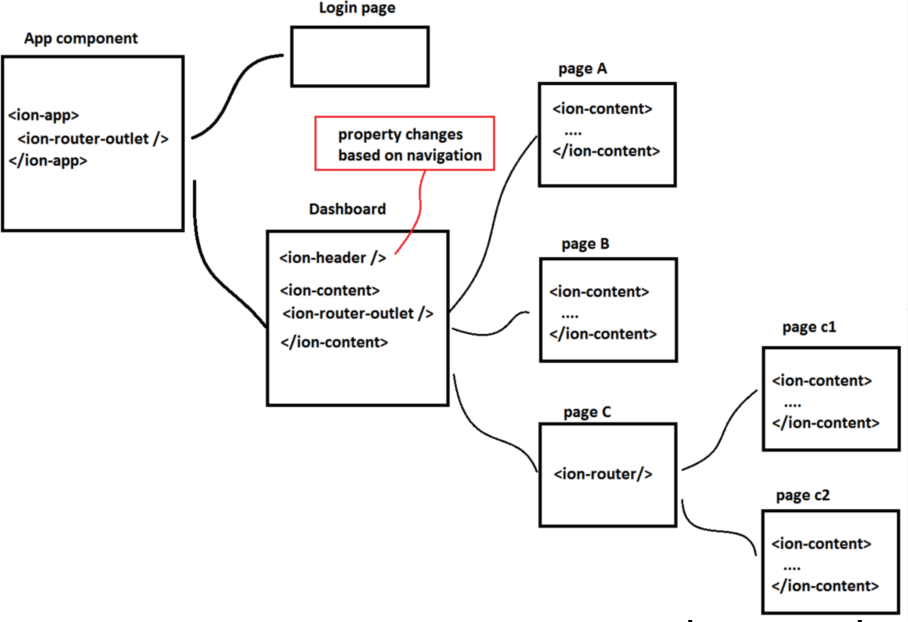
Because now I have one login page, and a dashboard page. They both get injected on the main router outlet from app component.
From the dashboard page onwards I have an extra router outlet which will load any page you navigate to after logging in.
- Each page has its own header (some with just a transparent toolbar with a menu icon, some others with a gradient background, some other with white background and border)
- There may be extra router outlets on a page which may allow you to navigate further
- Some pages even have a footer - like forms for the submit button
- For some pages there may be a background image on the main content
First approach I followed was to have the header in the dashpage and adapt its properties based on the navigated page. This resulted on an ugly transition in Andoird, since views slides from bottom to top as a whole and there’s a fixed header that doesn’t come with the content but remains and its properties changes. on Ios, that have transitions that slide right to left, the header remained and adapted in a smooth way while the content came in.
Then I changed so each page may have its own header with its configuration depending the case. This improved the experience on Android (though I notice that the content and the header doesn’t come in or leave smooth together, one appears or hides before the other it seems but it not that evident). With this, the transitions on ios are not nice at all because the header suddenly ‘appears’ and the content comes in with a transition. More over, having an image as the main content background makes it quite buggy for the content that comes in.
Which way would you recommend to have a nice transition on both platforms?
Posts: 1
Participants: 1


